
Design crypto investment platform for non-crypto users
Users don't understand crypto market and trust service provider to invest for them. How might we help users invest crypto with confidence?
Mimic web2 investment platform design pattern along with using word choices and data set that users used to
Desk research, User interview, UI/UX design
1 Product Designer
1 Developer
Cryptomind is a Thai CeFi mutual funds platform. It allows users to get involved in lower-risk crypto investment using traditional finance practices. The platform targeted non-crypto users who want to get exposure to digital assets but have limited resources (time, knowledge, capital etc.)
The mental model of traditional investors is to rely heavily on trust. They trust the service provider to manage their funds. The rise of emerging technology and digital assets also attracted them to invest in new asset classes but with limited resources (time, knowledge, capital etc.) they trust experienced investors to help them get exposure.
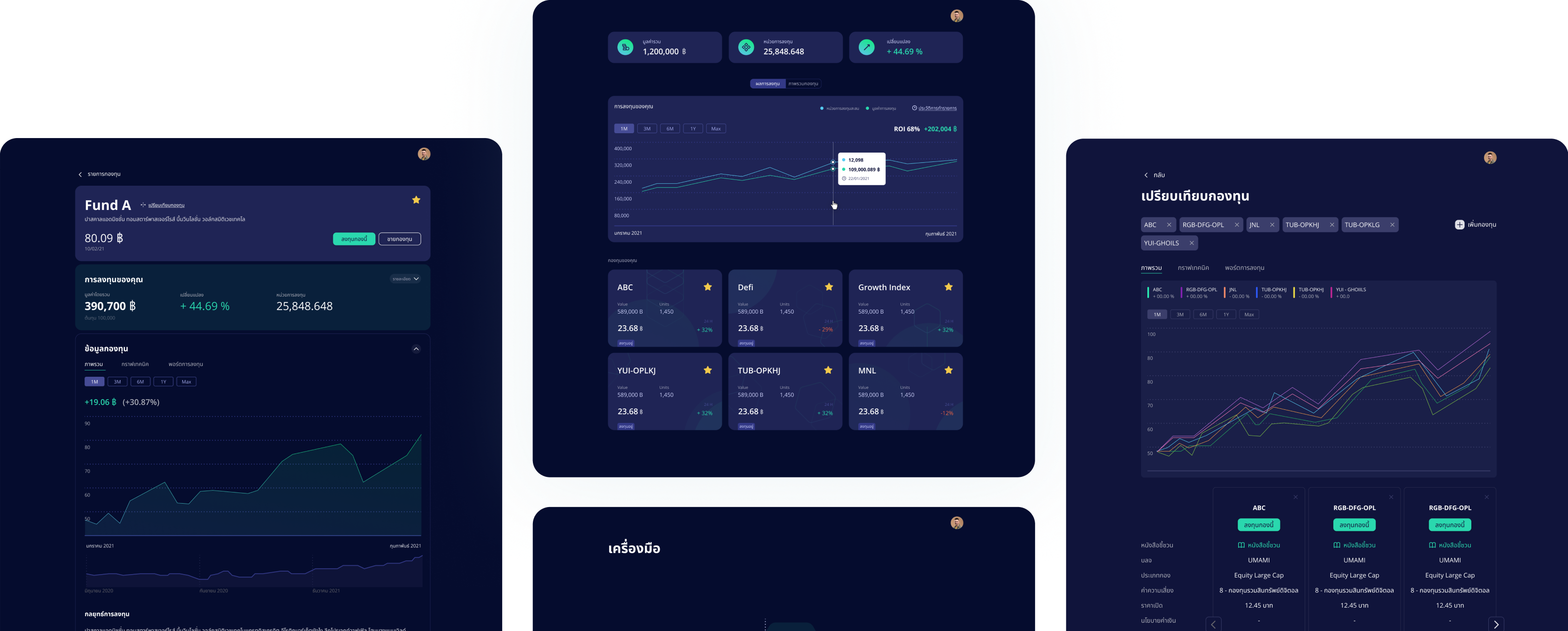
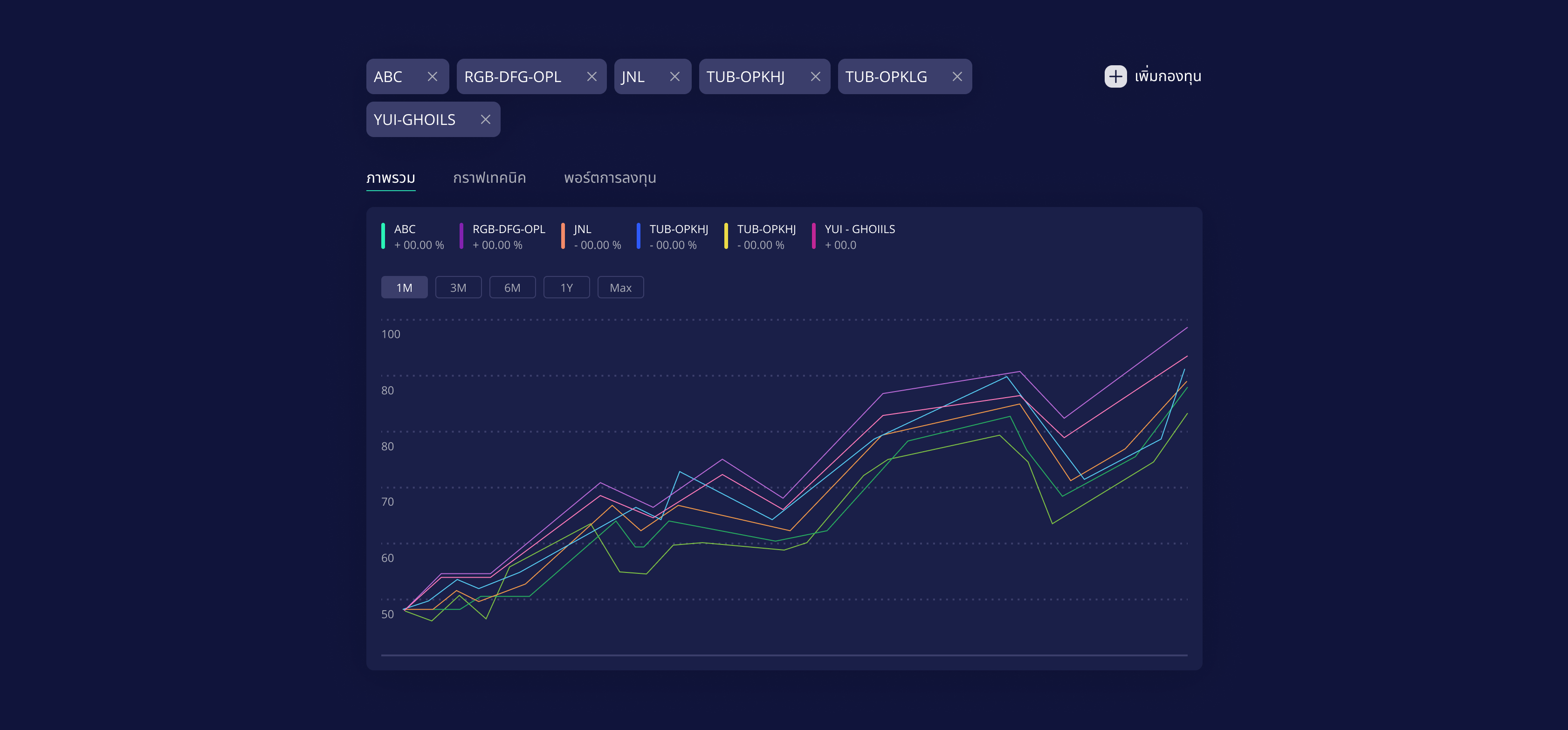
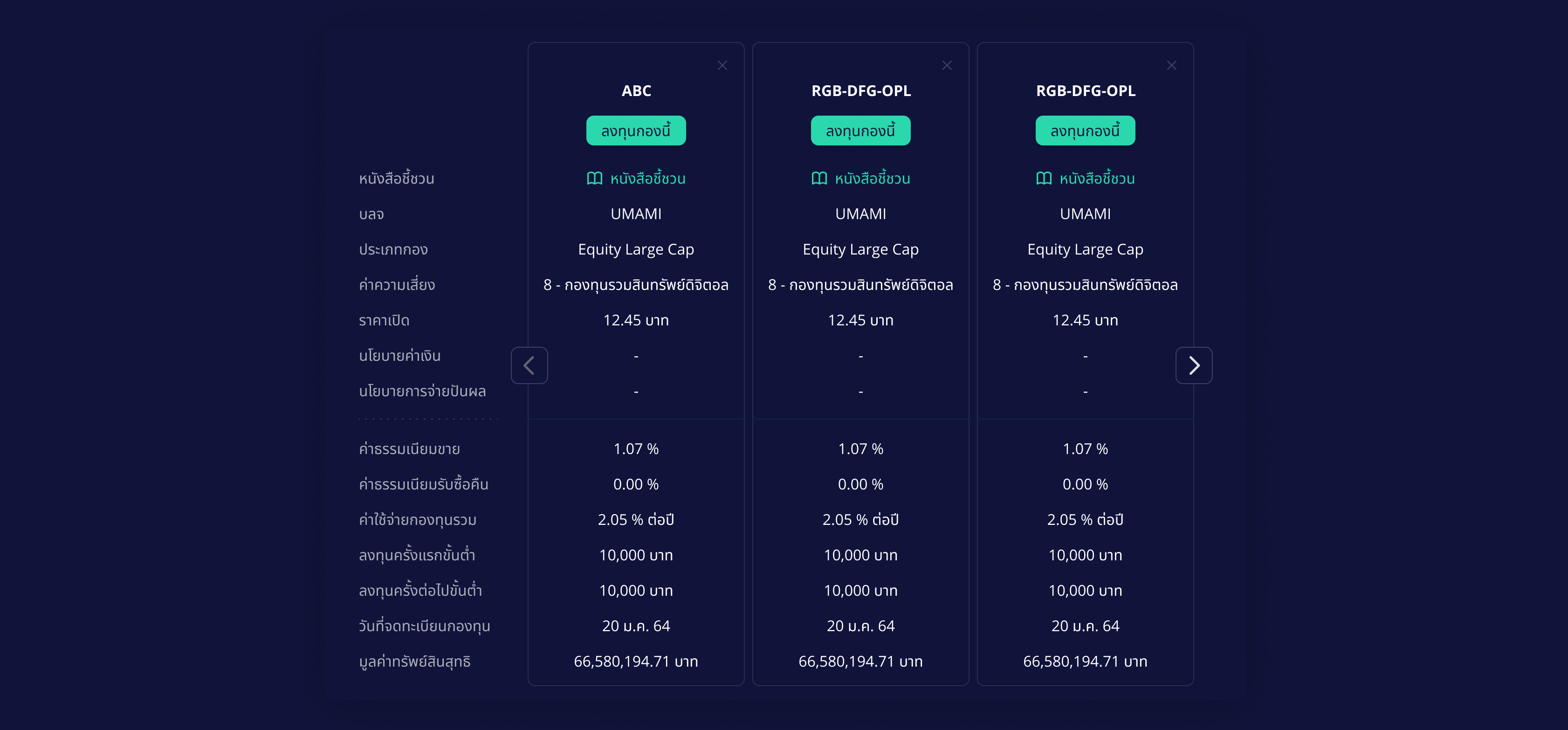
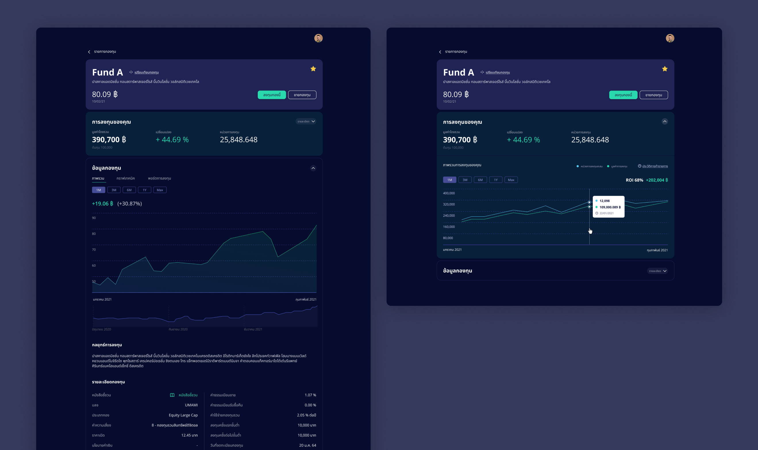
A common behavior of investors is to compare all conditions before deciding to invest, tracking investment progress also helps them decide or plan future execution. To help build between the users and the platform, all the mutual fund’s information needs to be easy to find, clearly detail an investment strategy, and openly present the terms and conditions.
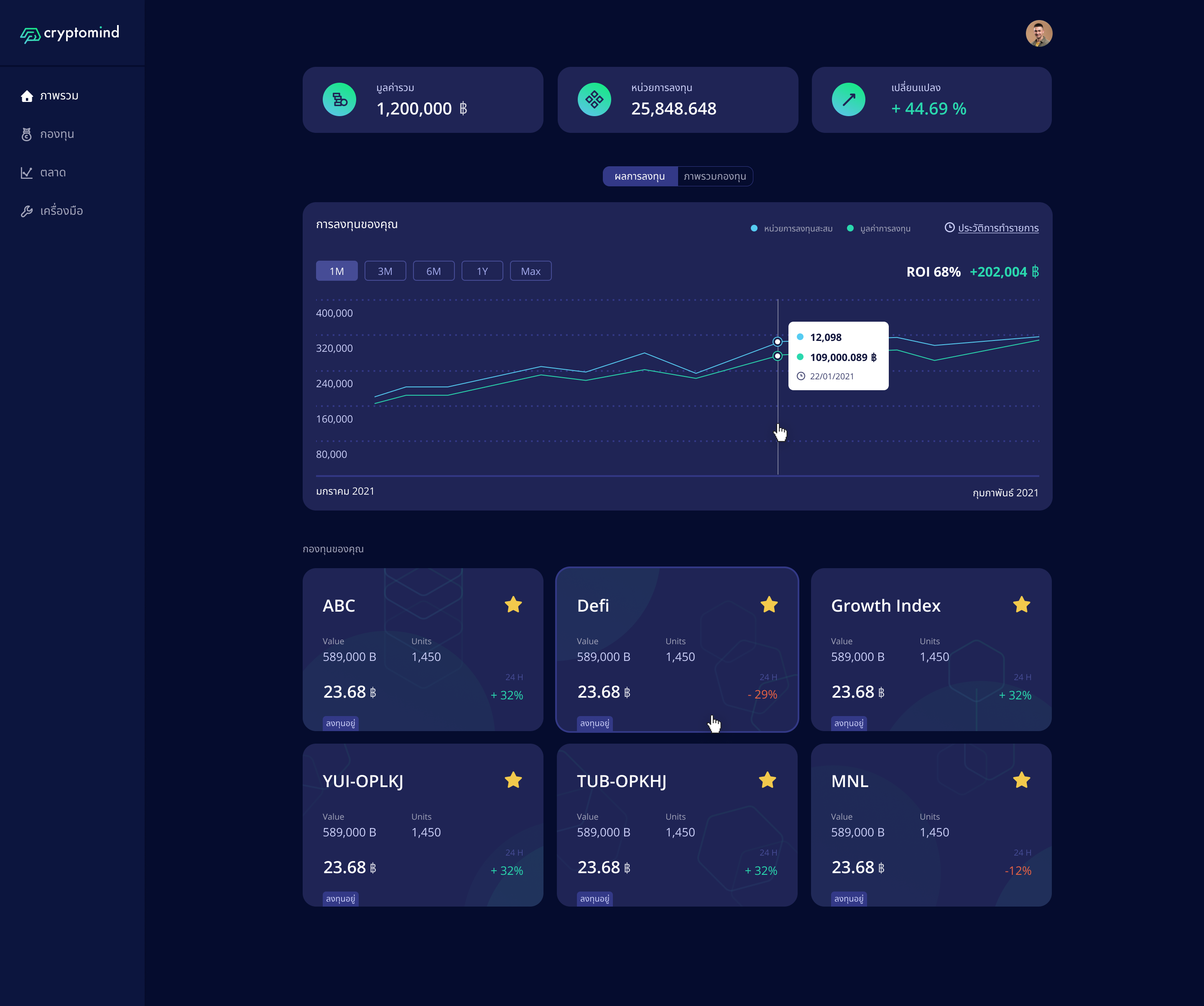
A comparison feature has been added to help users compare all relevant investment funds. The dashboard interface highlights total investment value, total shares, and value change. These are the most significant numbers for most investors. Charts have also been added to help users visualize and compare data easily on both the dashboard and the funds’ page.
The challenge of this project is to deliver a lot of information and to display it clearly. In order to do that, I utilized The Law of Proximity and The Law of Prägnanz. This involved displaying sets of information within simple shapes and organizing these into groups. I then managed the empty space to help users differentiate content types.
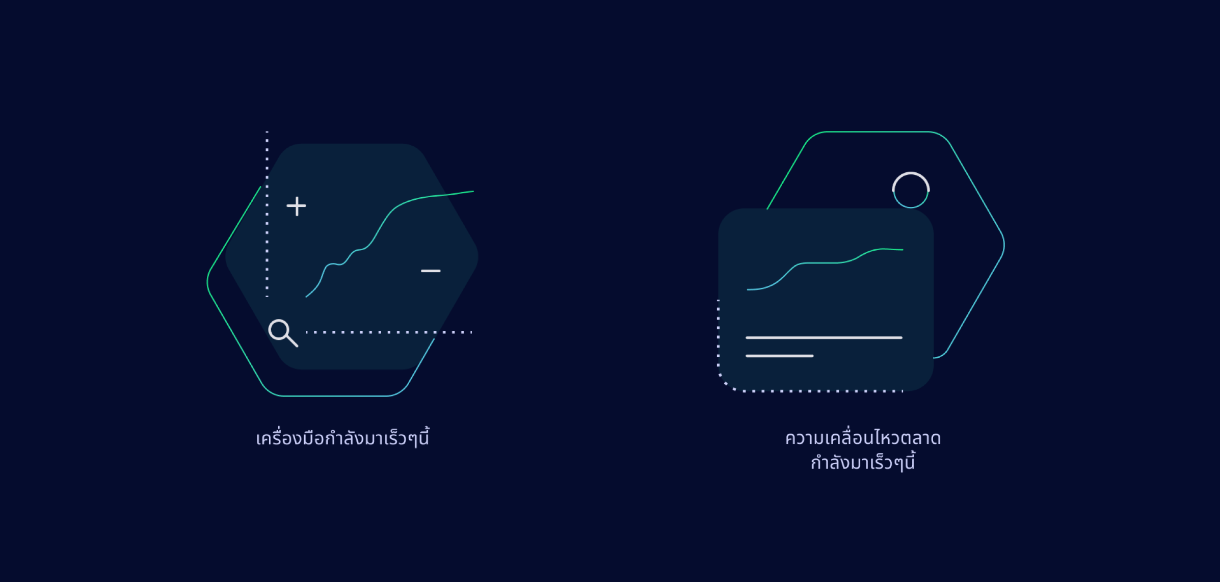
Deep blue and green with a range of pearl opacity were used as the main theme to instill trustworthiness, and convenience. A dash of bright neon green and a few other colors were used to add excitement and a modern touch to the visual.
Simple geometric graphics with round corners were used as the main theme for all illustrations on the platform e.g. icons, empty states, card decorations. This added a playful element to the design, combining a user-friendly quality with the cutting edge identity of the brand. Moreover, the shape is simple enough so that it does not interfere with the already content-heavy interface. Hexagons, which feature as part of the project's logo, were also used repeatedly to create a strong sense of the brand.