Facilitate decision making on Defi Vaults
Prioritized information based on users’ mental models and controlled visual complexity
Lorem ipsum dolor sit amet, consectetur adipiscing elit. Suspendisse varius enim in eros elementum tristique. Duis cursus, mi quis viverra ornare,.
Desk research, User research, UI/UX design, Usability test, Prototyping
1 Product Designer
1 Developer
** This is an unreleased version, the final concept of the platform has been iterated **
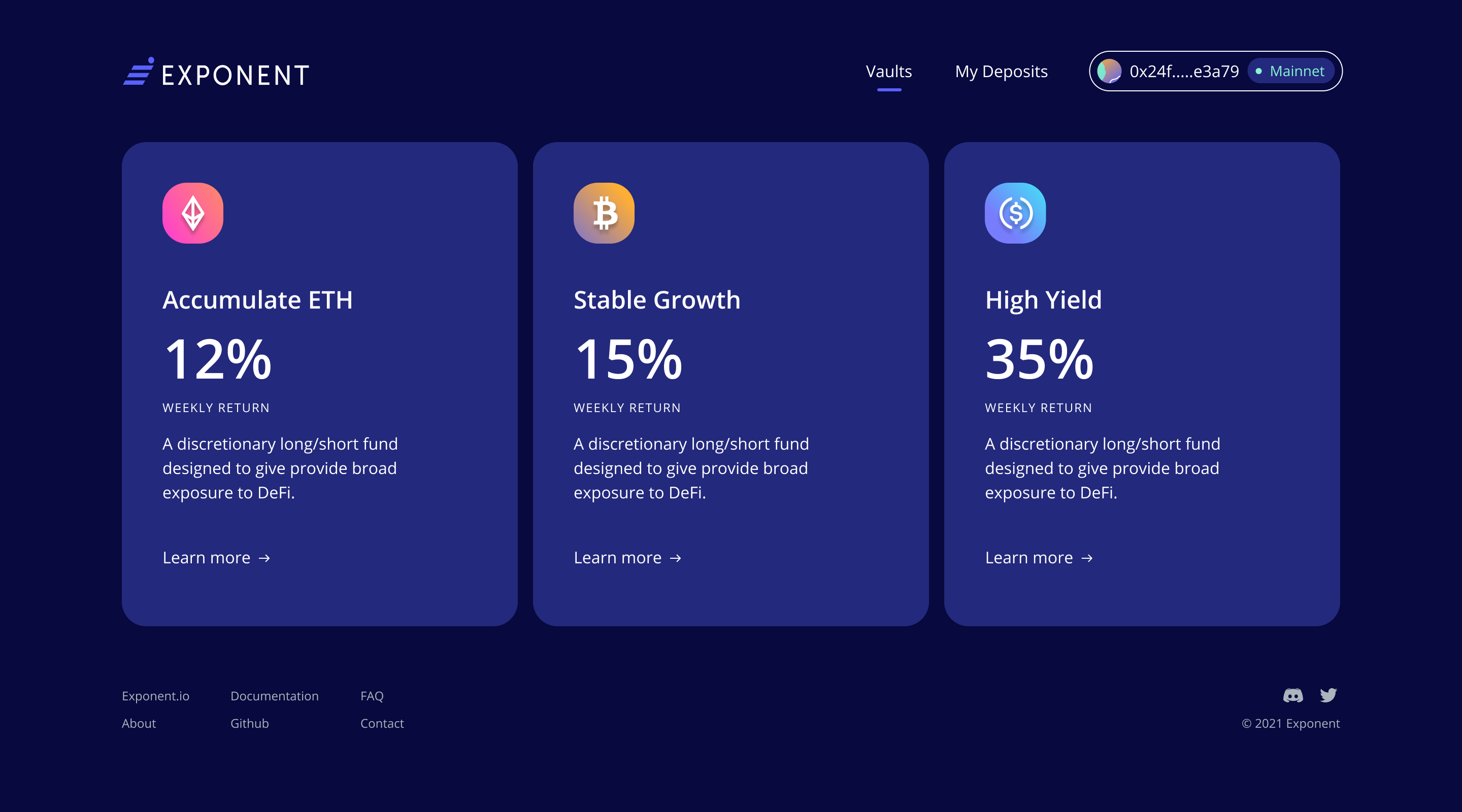
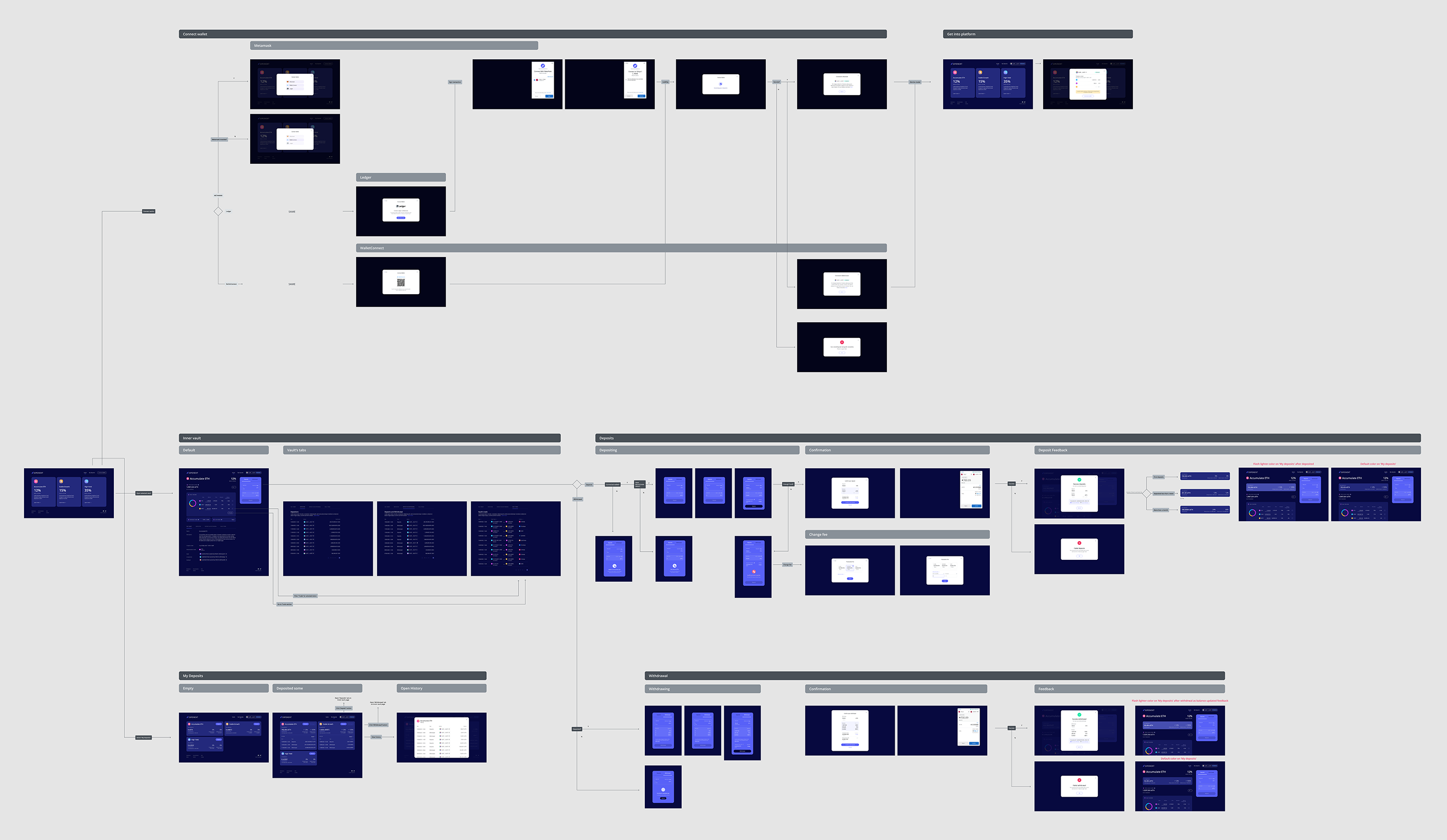
Exponent is a Defi Vaults service on the Ethereum network. It allows users to deposit funds into auto-compounding smart contracts known as vaults. The platform offers various vault strategies in which users can optimize their yield based on the vault’s risk and returns.
My task was to come up with the MVP version of the platform. I worked with the team to understand some initial user stories, including:
The deliverables were lo-fi wireframes, Hi-res design, prototypes, and design systems.
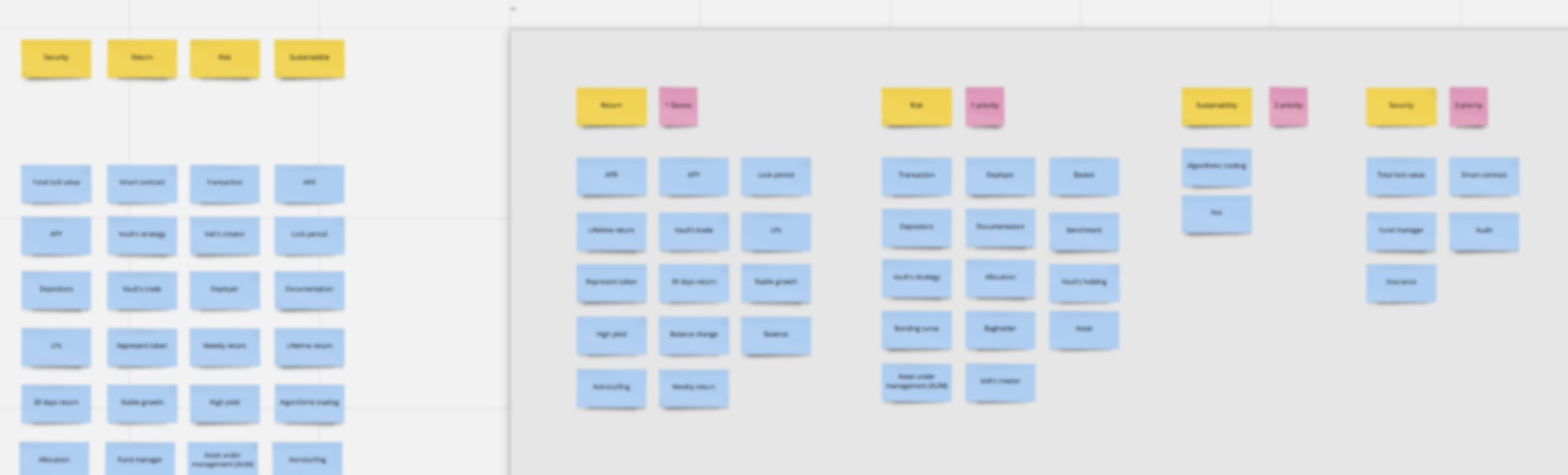
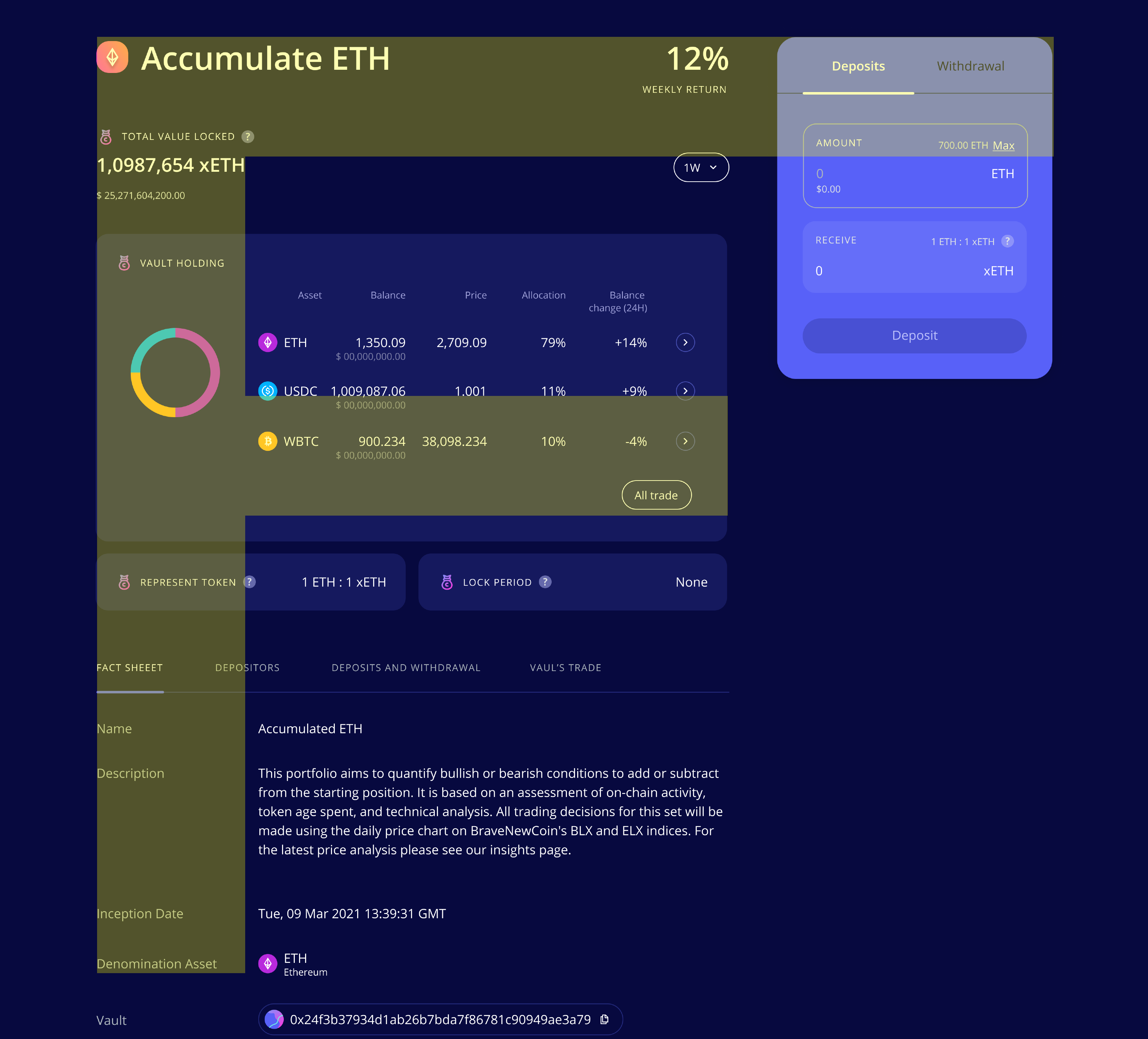
Generally, risk and returns are key factors a crypto investor considers before an investment. The return rate has often been used by projects to entice funds from many users. Investors must also question how sustainable the returns are in order to evaluate the risk. This leads any serious investor to a comprehensive exploration of a vault’s strategy.
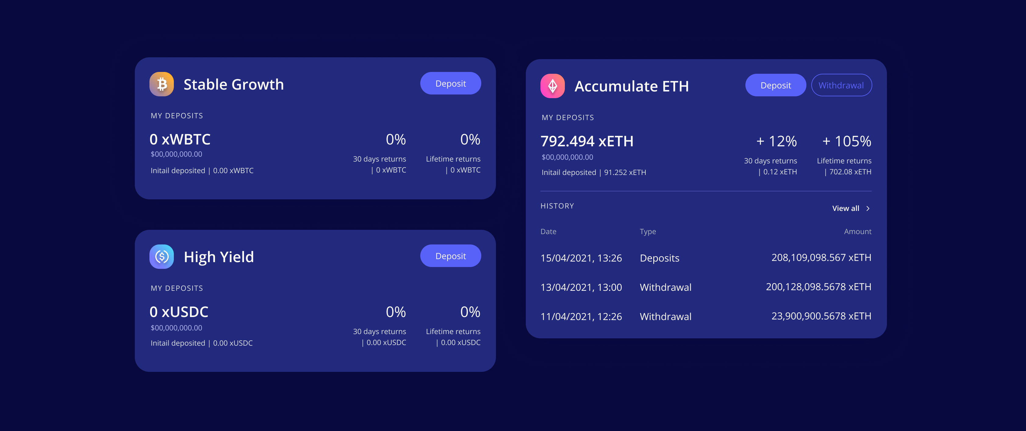
These are keys common data points users use to evaluate the vault :
Helps establish how much trust others have in this vault. The higher the better.
Which tokens are being used to generate yield? How does the auto-compound function? What platforms are involved in this strategy? These questions help users evaluate risk from smart contracts and impermanent loss.
Establishes how many users have funds in the vault.
Establishes how active the vault is, and in which direction the money is moving.
Allows users to audit the service and its provider.
Is there a lock period? What else can I do with the token?
To understand how people prioritize key considerations, I interviewed via video conference with 5 people for quick adHoc research. I then came up with information architecture and established the visual hierarchy for the UI.

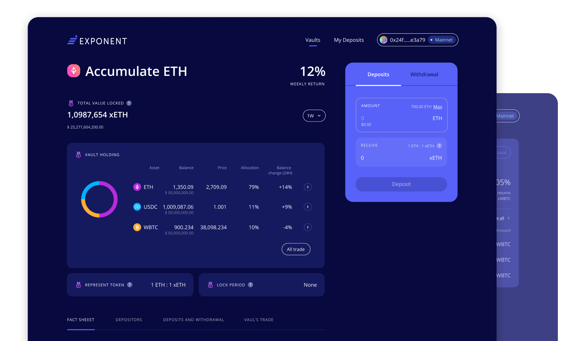
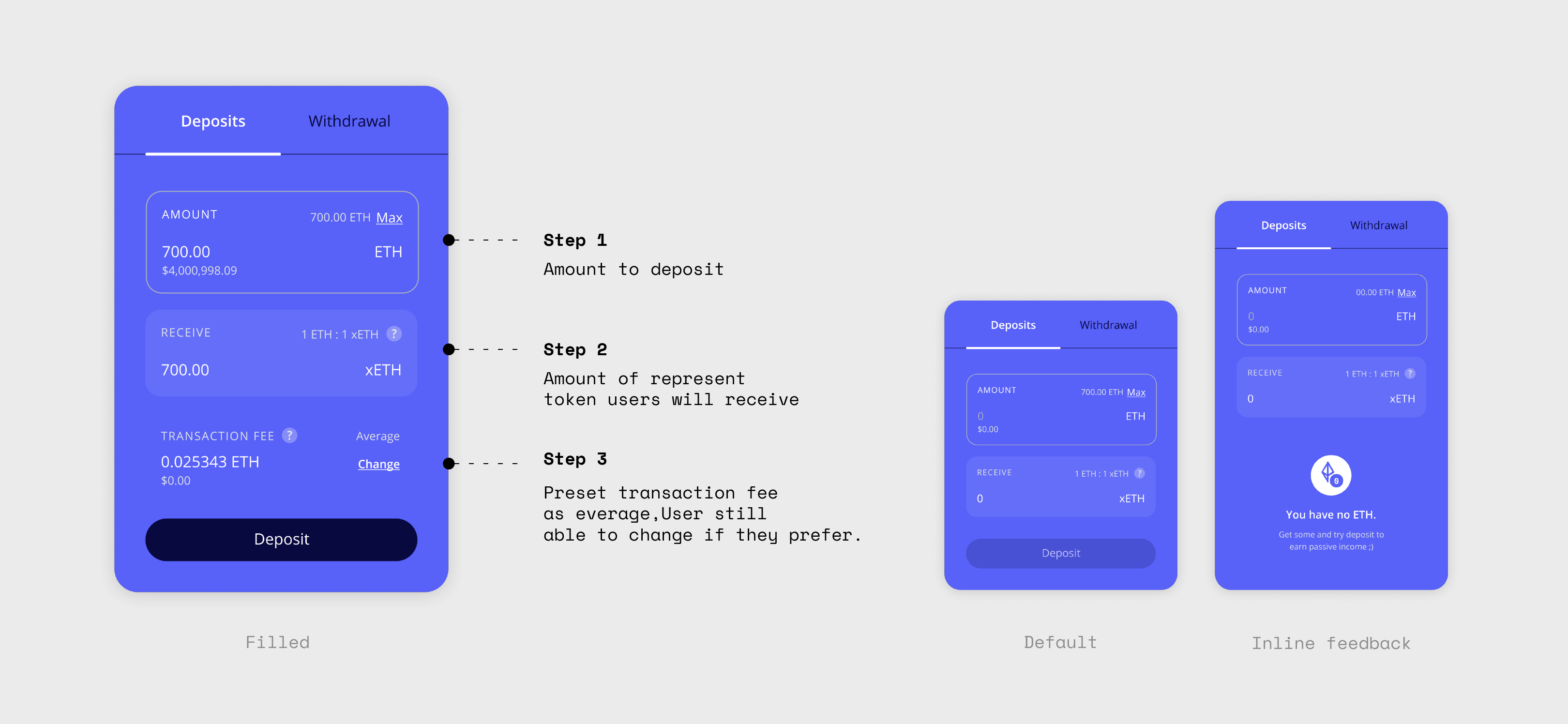
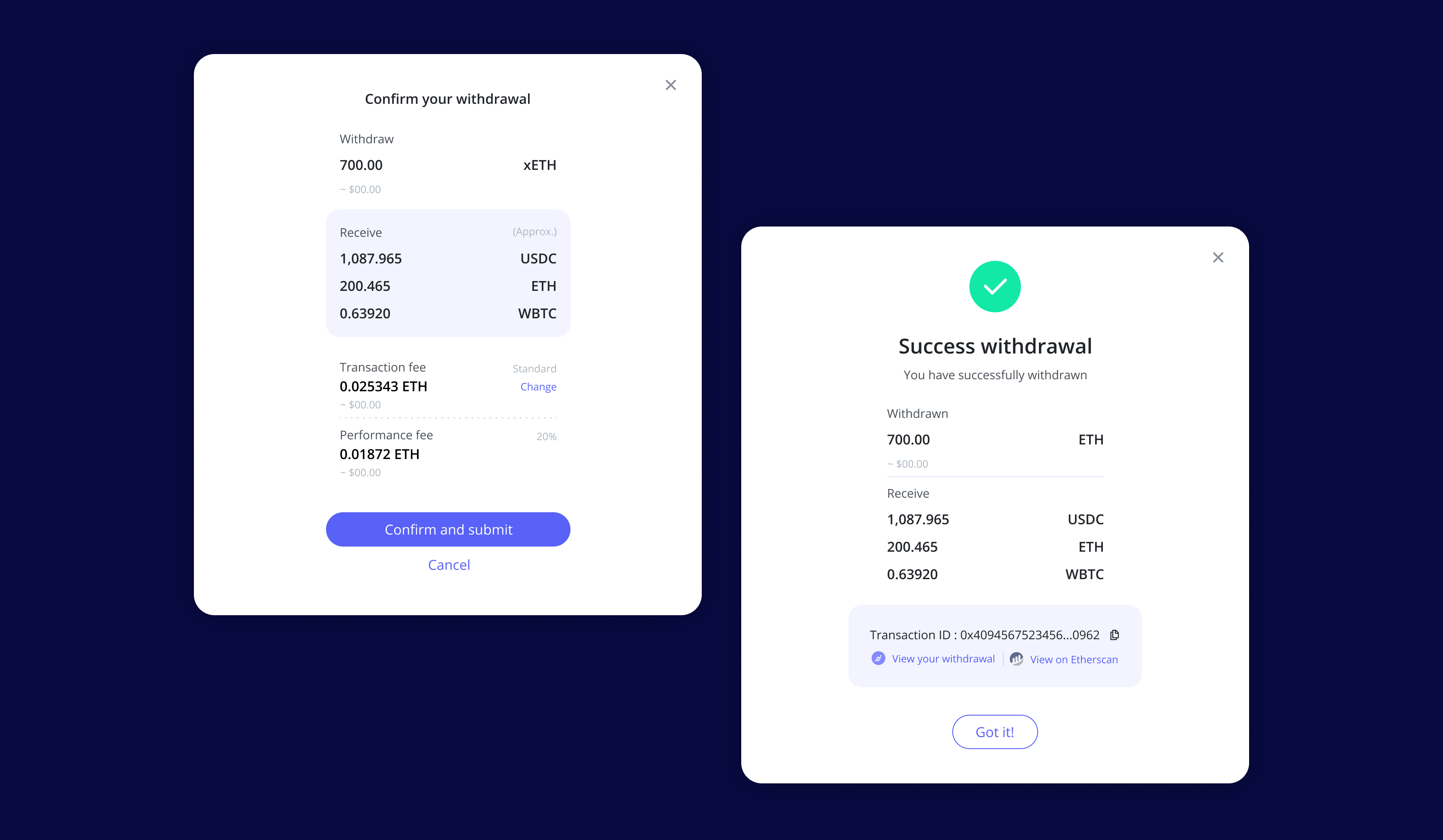
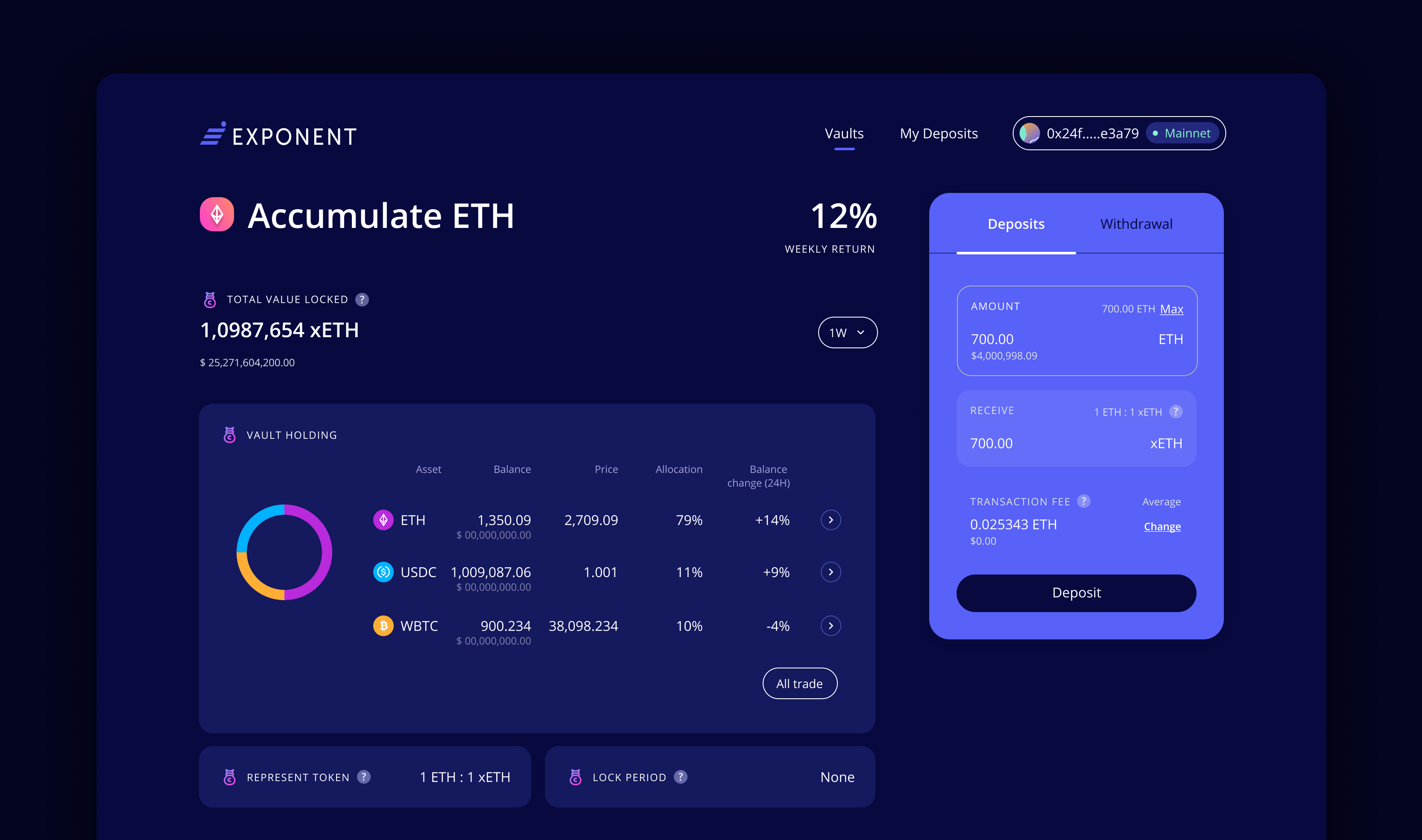
Deposits and withdrawals are key functions of the platform. However, because the nature of Web3 values ‘full-control’ and ‘transparency’, there are multiple steps users need to complete.
To streamline the process, Hick’s Law was applied to break a complex task into smaller steps in order to decrease cognitive load.
The first step of depositing was shown by default on the top right of the page along with information about the vault. This was all displayed in an ‘F pattern’, to clearly convey to users everything they needed to know about each vault.
Deposits and withdrawals were divided into 3 steps. The first step concerned entering the input amount, viewing the received amount, and suggested a default transaction fee (fee customization is optional). Second step is to review and submit the request. The last is a feedback screen with option to review and track the transaction.
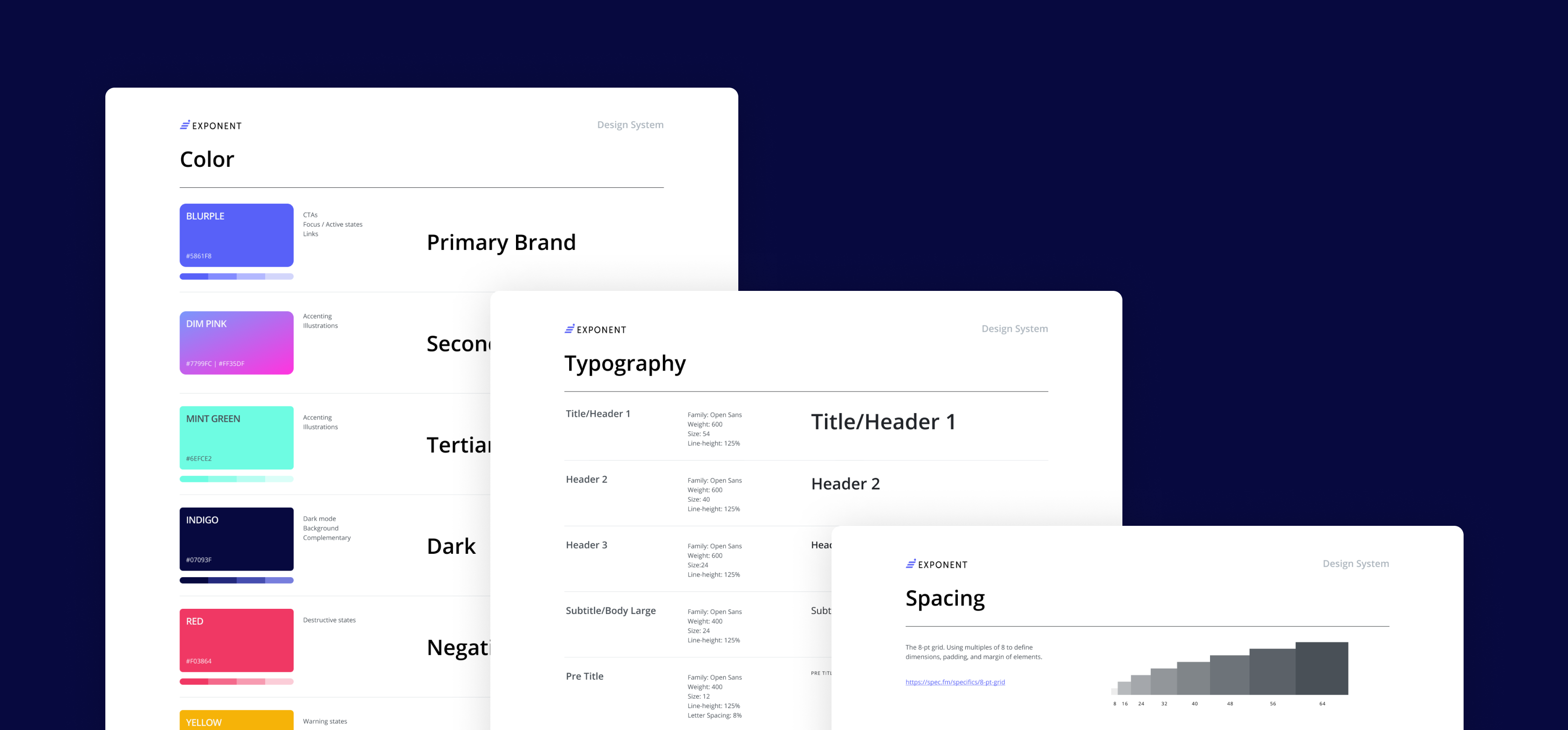
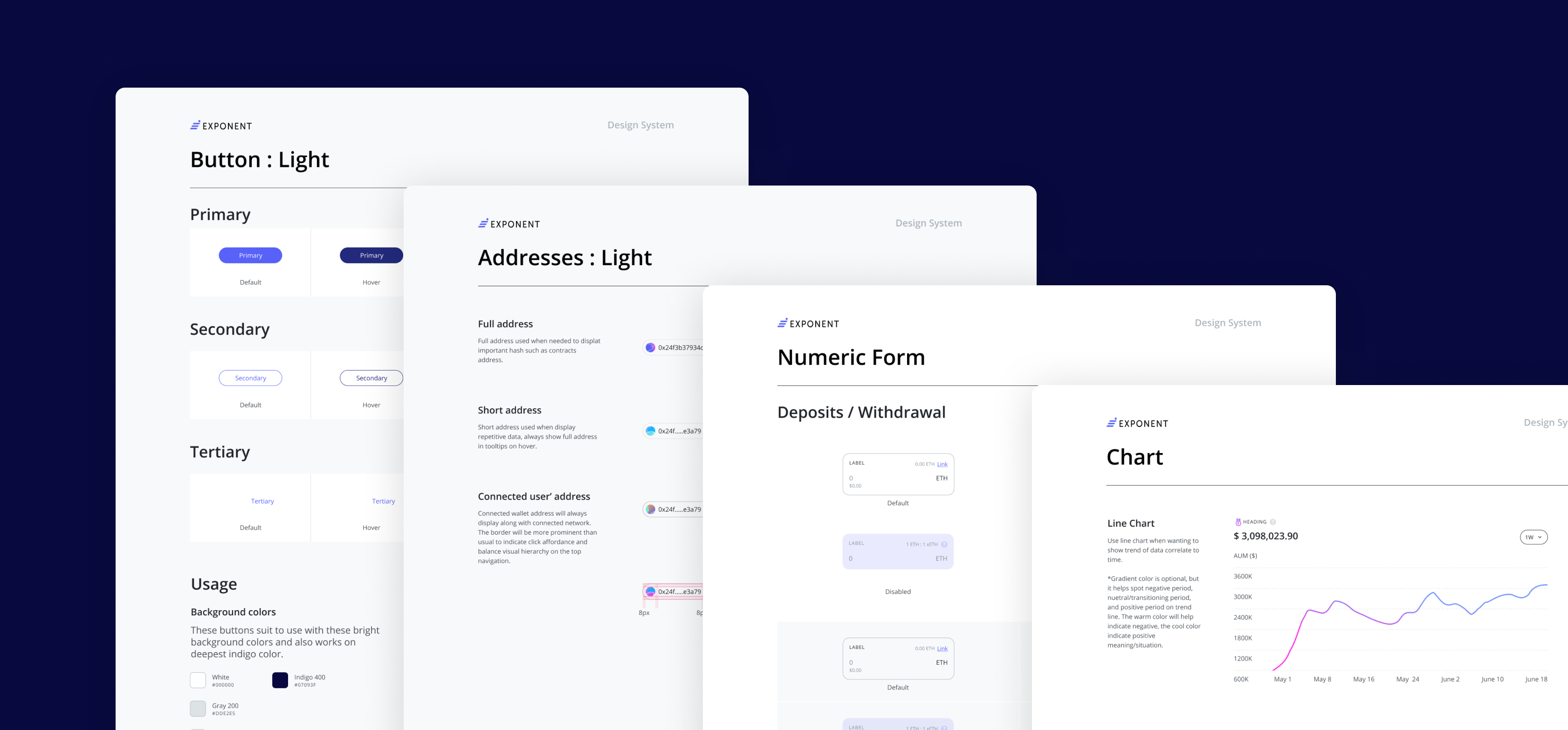
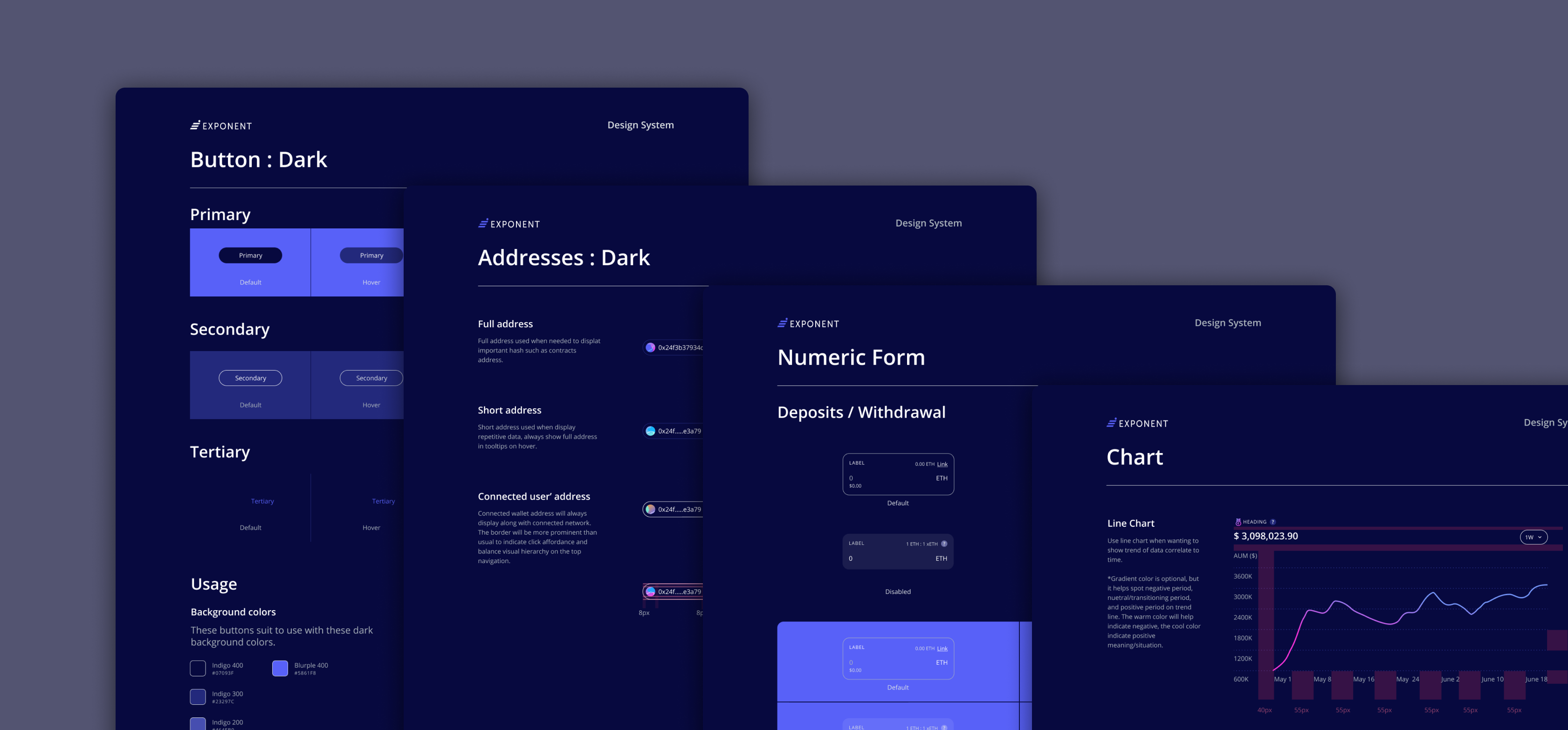
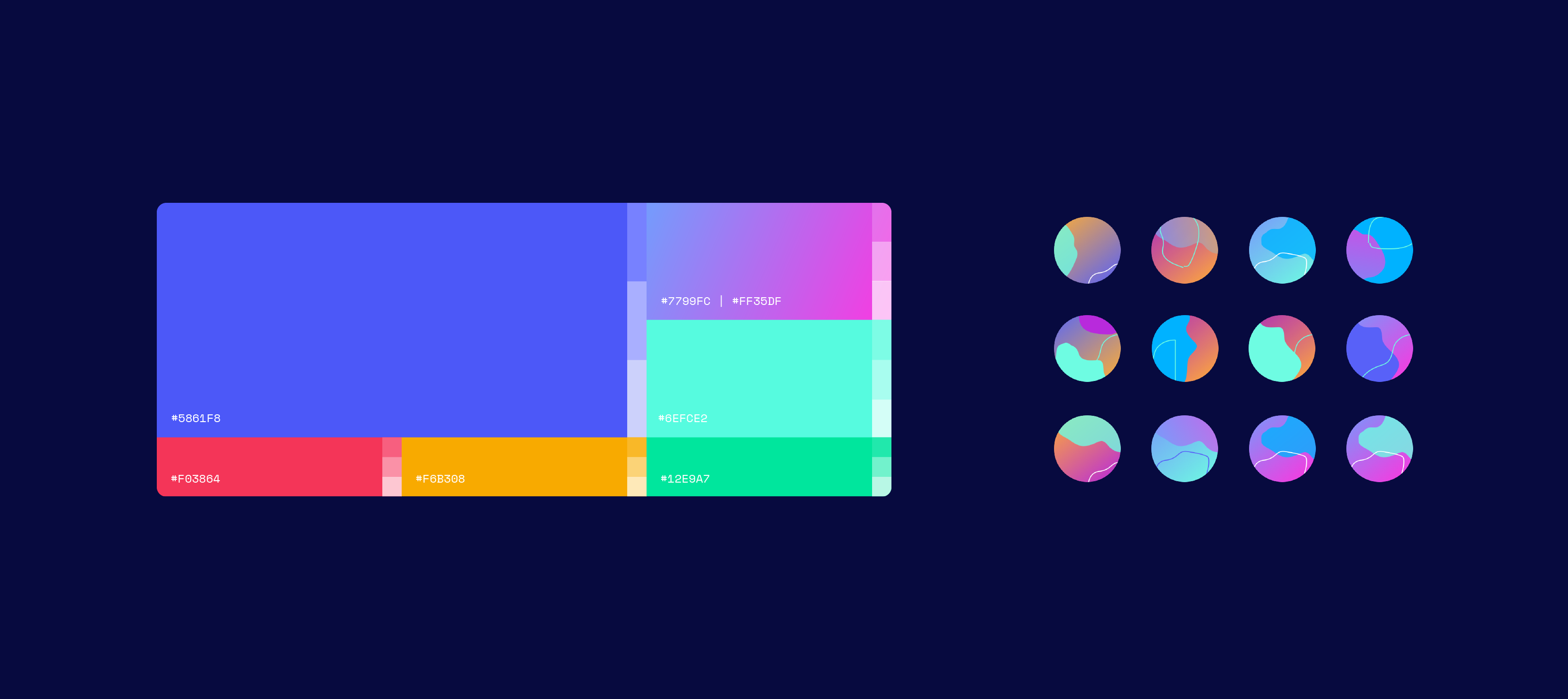
As the platform targeted organizations, the design was to be visually trustworthy yet friendly and a little adventurous.
Dark blue was chosen as the main theme to gain trust and to create an impression of calm. Gradient and neon colors created the sense of a dynamic, progressive, adventurous, and technologically forward thinking project. Curves and round corners help impress a sense of friendliness.
Finally, I created a design system on Figma that made integrating any future updates efficient and speedy. A design guideline was also included in the handover to help the team and future designer understand design decisions and how to apply or update the design in the future.