Users unfamiliar with cross-chain interaction, differences in the fee model for deposits, transfer, and withdrawals were challenging for them which caused uncertainty and anxiety.
Optimize workflow, emphasize on the difference of fee model, and teaching unfamiliar concept along the way.
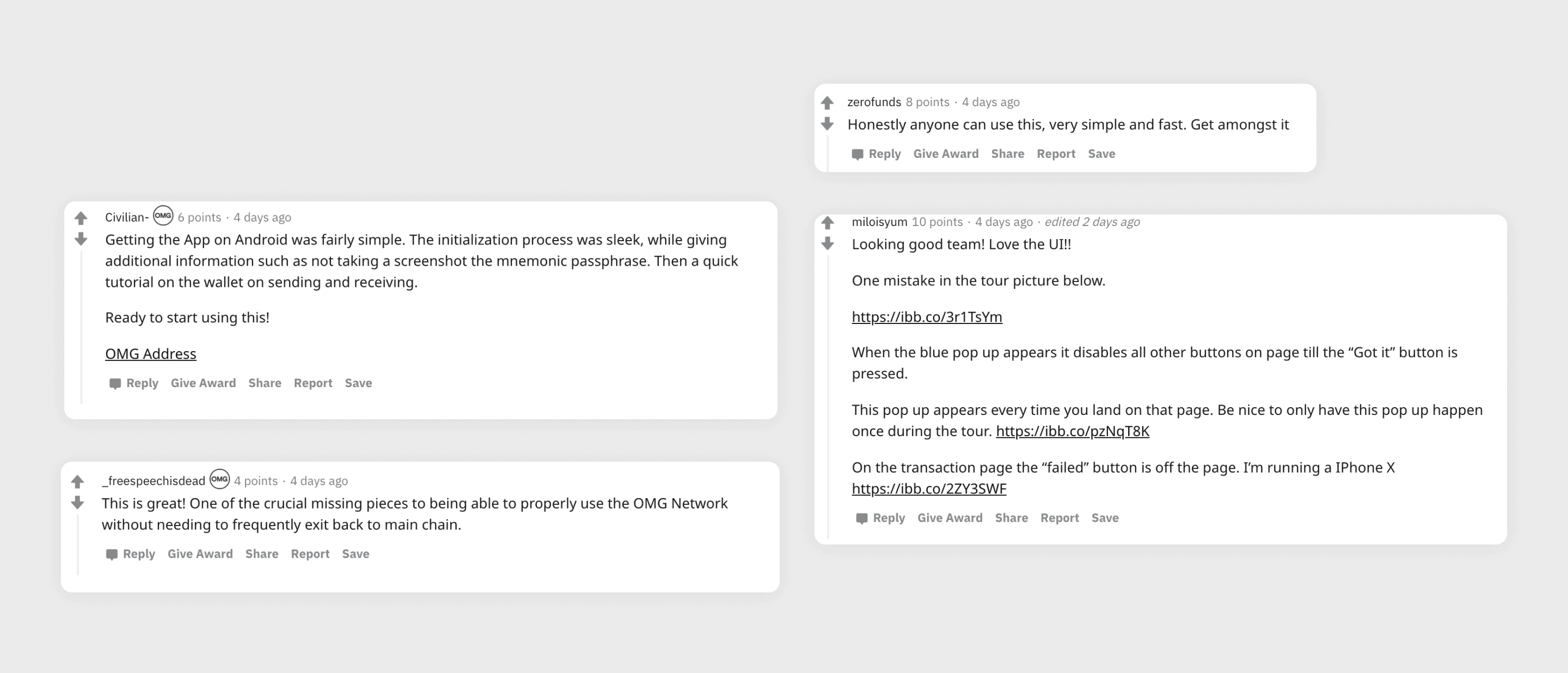
The design used as reference for builders on our network, and became a template for POC (Proof of concept) design when demonstrate to potential clients.
Users research, UI/UX design, Prototyping
1 Product Manager
1 Product Designer
2 Developers
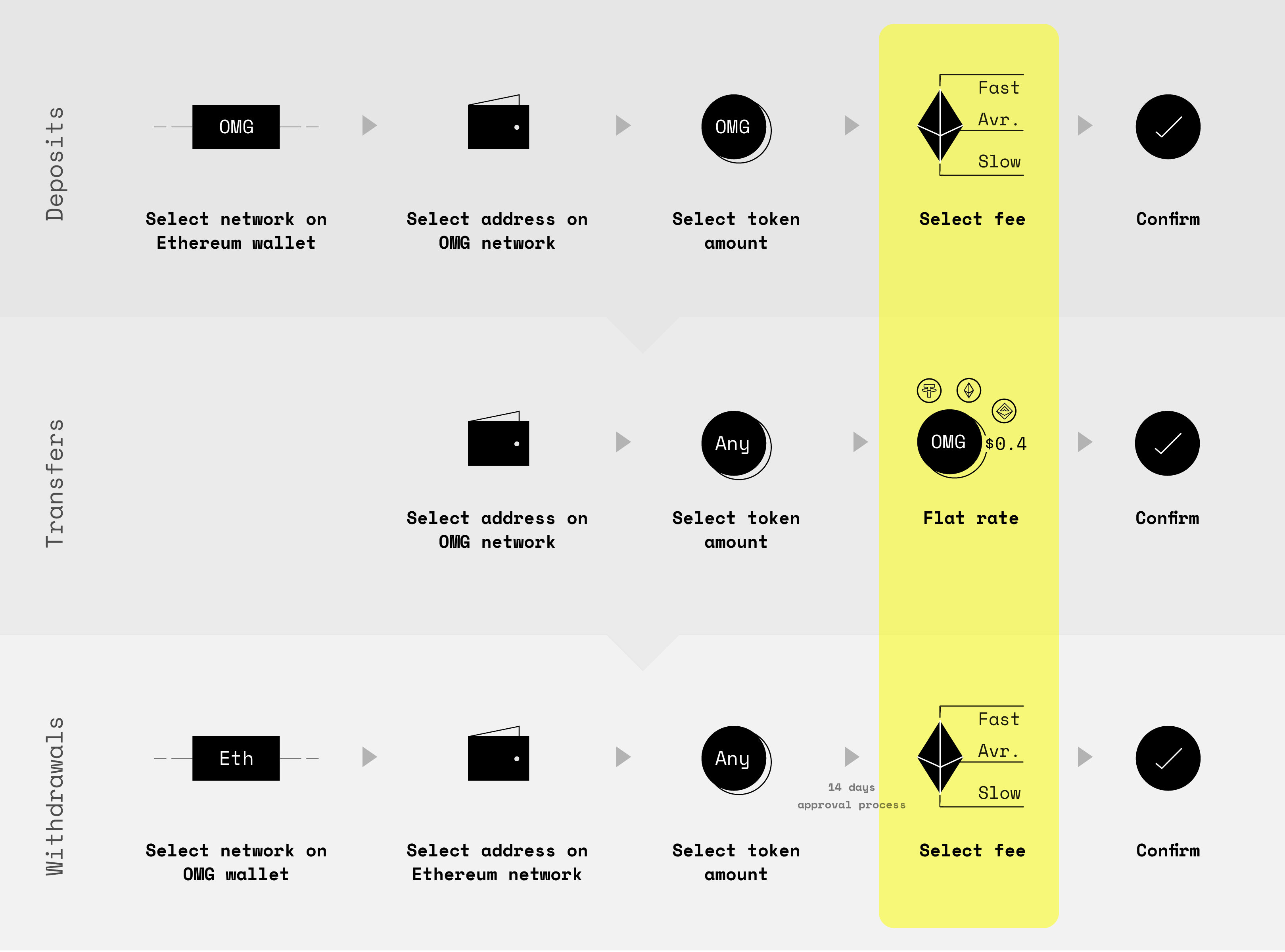
The OMG Mobile Wallet aims to be the easiest channel for any enthusiastic user to start transacting on our Layer 2 network. However, the fee model for depositing from the Ethereum network to the OMG network, transacting on the OMG network, and withdrawing from the OMG network back to Ethereum network were differences. Users didn’t understand why it needed to be different, which caused uncertainty and anxiety.
In order to teach users moving funds from the Ethereum network to the OMG network, users' Ethereum wallet needed to be compatible with our network as well. The question come to mind, "How would users do and understand when transfer from the Ethereum network to the OMG network from existing Ethereum wallet in the market?"
I tested 2 scenario to understand which one had frictionless and fit with users mental model the most, which were

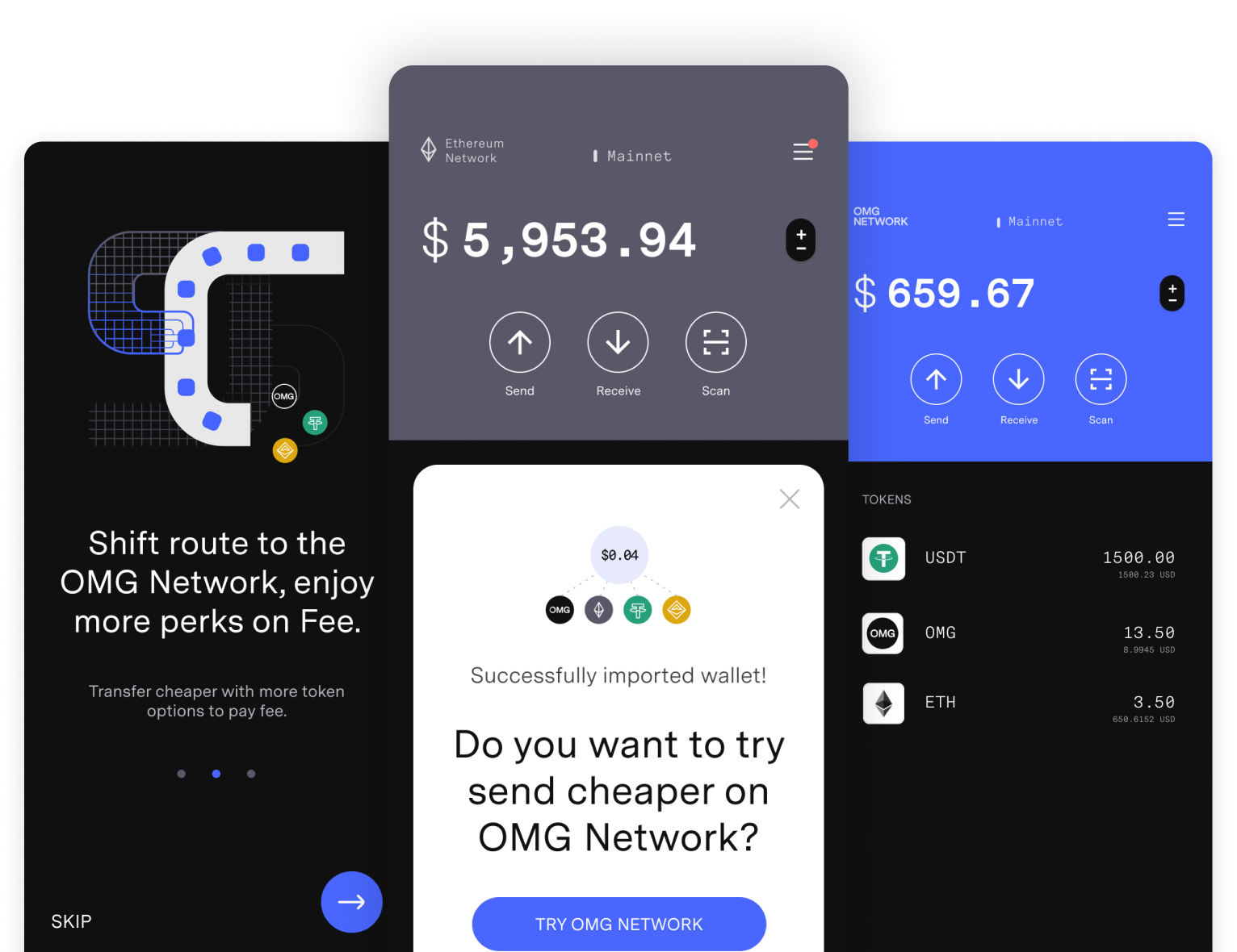
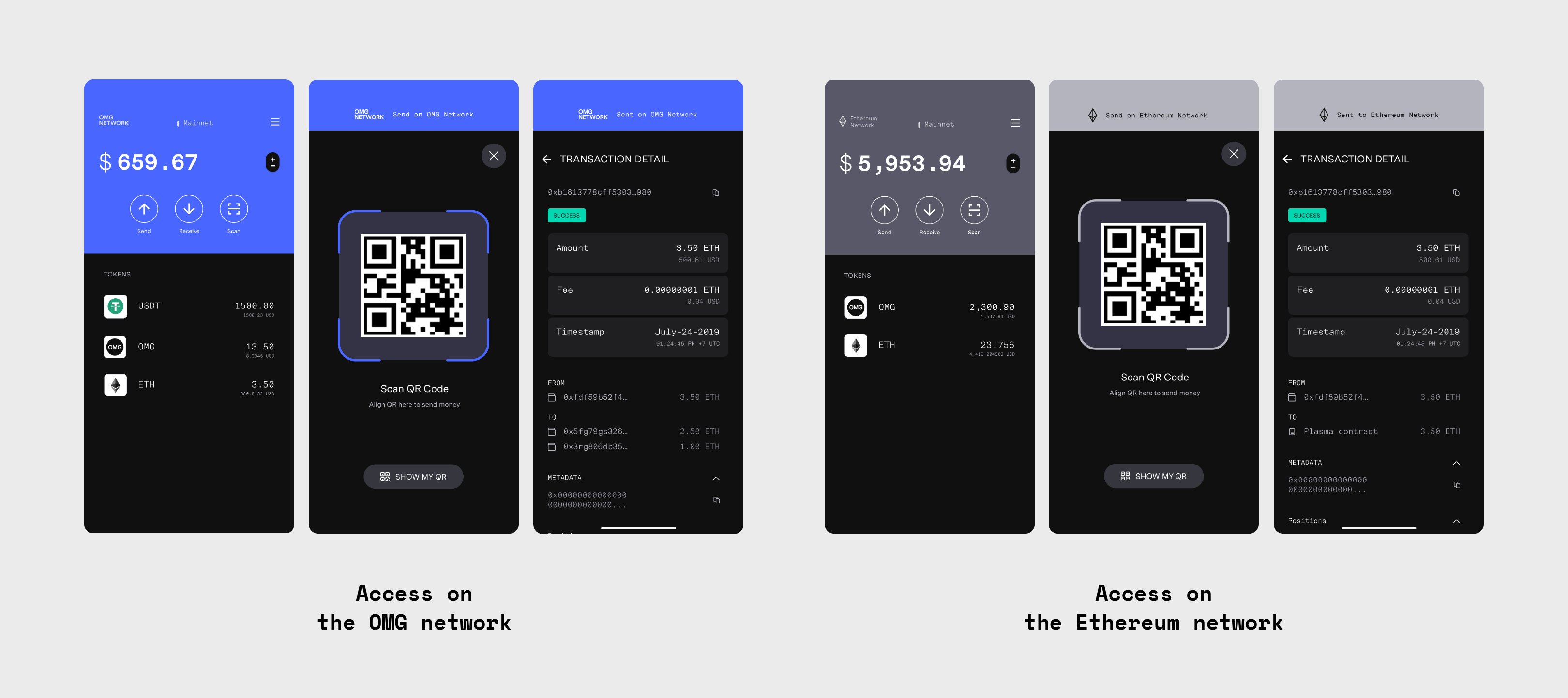
Our crypto-native users value freedom, full access, and full control. Because of this, we set out to offer a tool that will work seamlessly with the Ethereum network without relying on a third party tool. With this in mind, it’s crucial for the wallet to allow users to access, transfer, and track history on both networks.
The challenge here was to help users distinguish which network they are using, while also ensuring that the web3 UX patterns were similar with what already built on other wallets, to maintain a sense of familiarity.
According to our research, even though users were predominantly crypto natives and enthusiastic about OMG Network’s technology, the level of understanding around how it worked varied.
Builders had the greatest level of understanding. However, there was a high level of uncertainty regarding how the UX was going to function on the interface level. Our goal was to help them build compatible products that were intuitive for their users.
Tech savvy users understood the concept, yet weren’t sure how it actually worked.
Enthusiastic community members were keen to understand more, and we wanted to encourage them to transfer funds on the network.
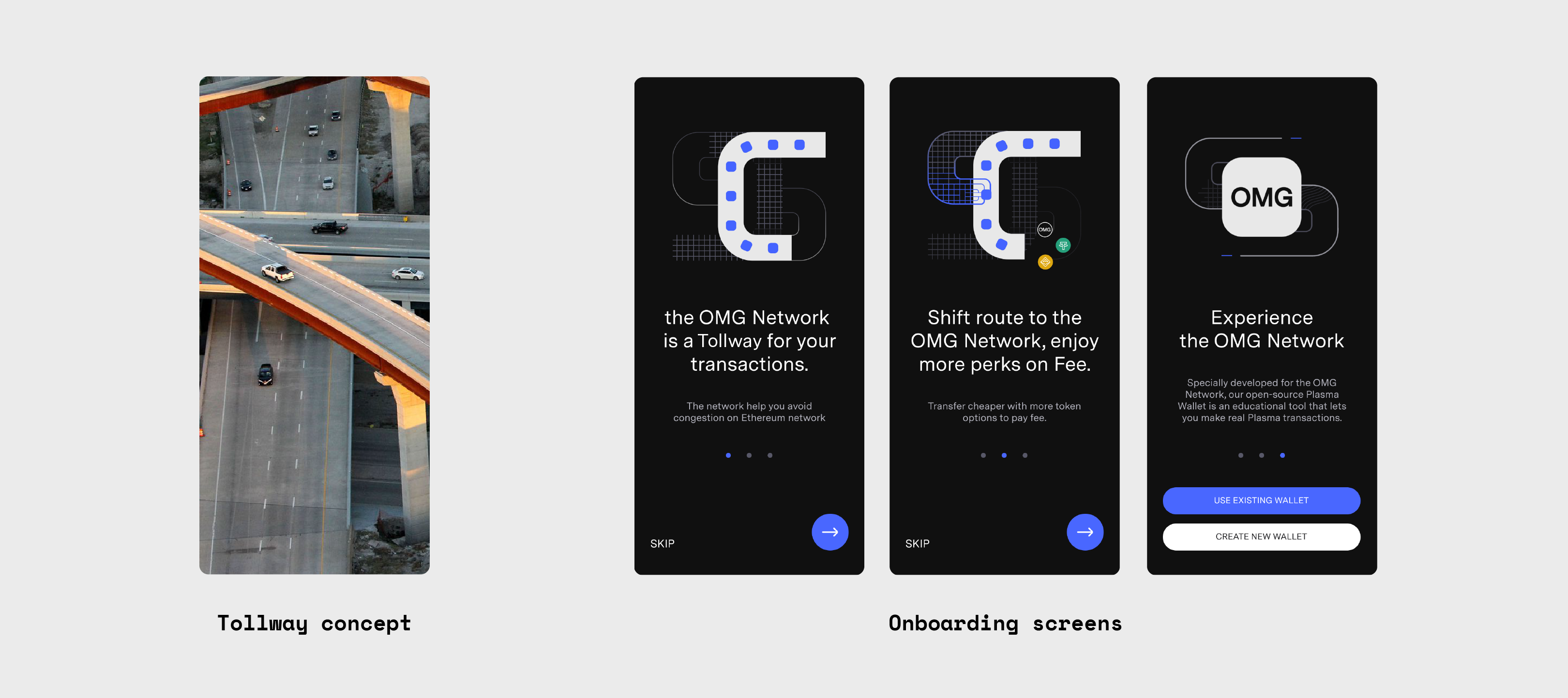
The wallet set out to make users learn by doing. Metaphors and storytelling have been proven to help people learn things easier, people learn better when combine information with emotion or things they already know. These were applied to help users learn new concepts as part of their onboarding.
Additional processes on the Layer 2 that may seem unfamiliar were also emphasized to new users. This kept our user base informed of how and why our service functioned.

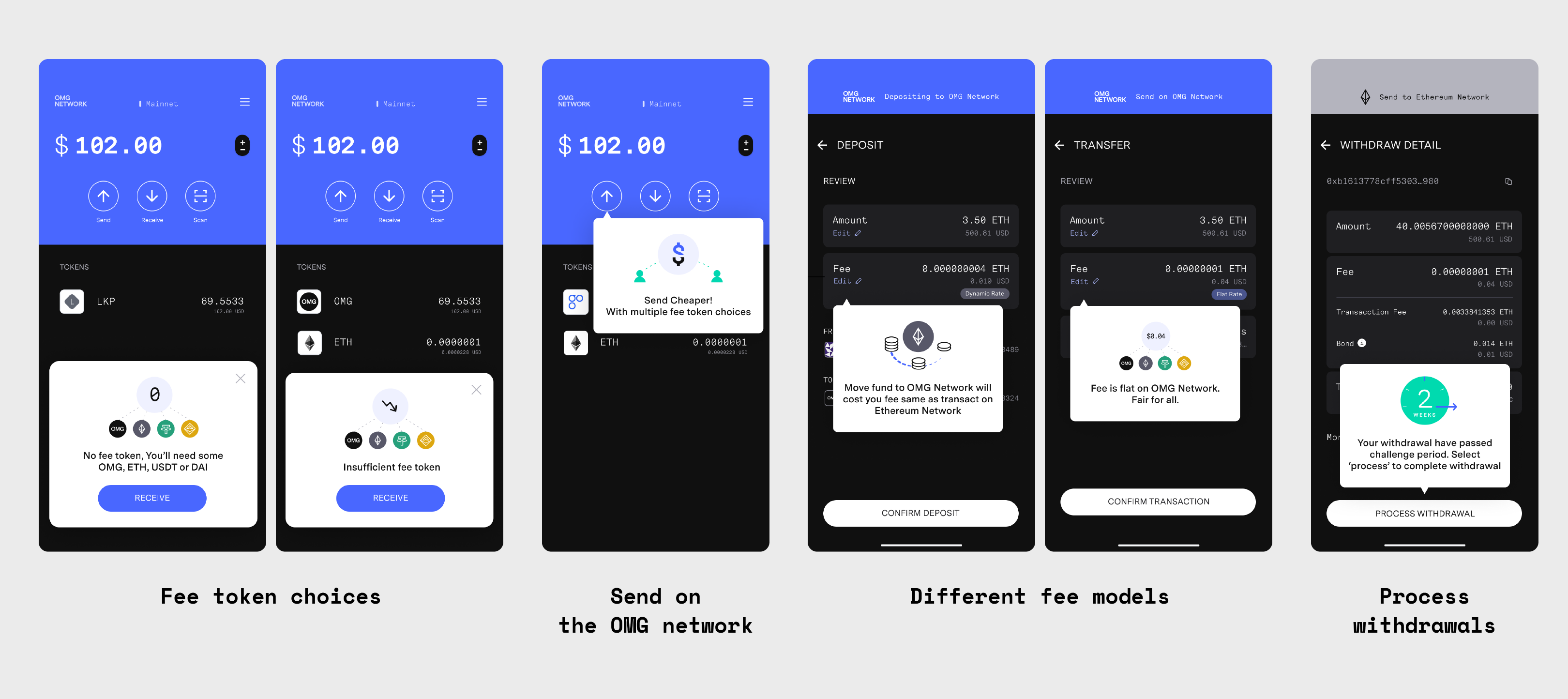
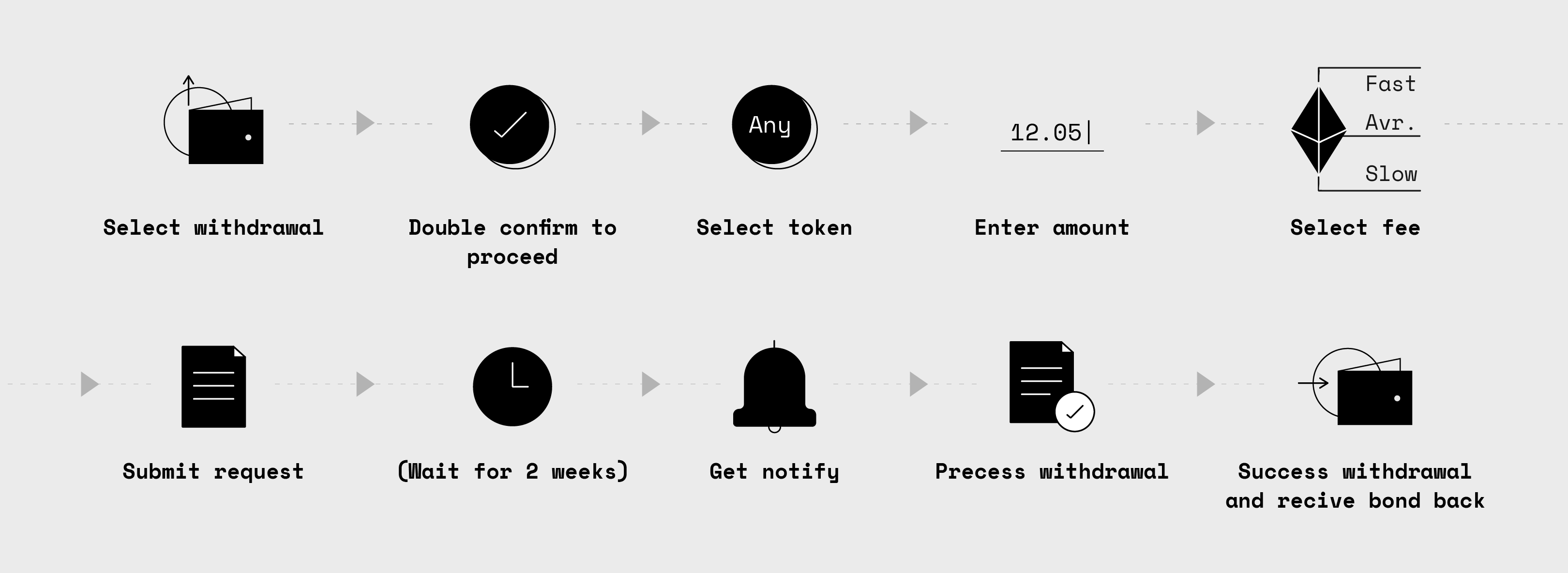
Transacting on our Layer 2 was no more complicated than transacting on Ethereum Layer 1. However, the withdrawal process from Layer 2 to Layer 1 was more complex and needed a longer processing time.
The process was divided into steps to reduce the cognitive load. Prompt help was also offered to help reduce users' concerns.
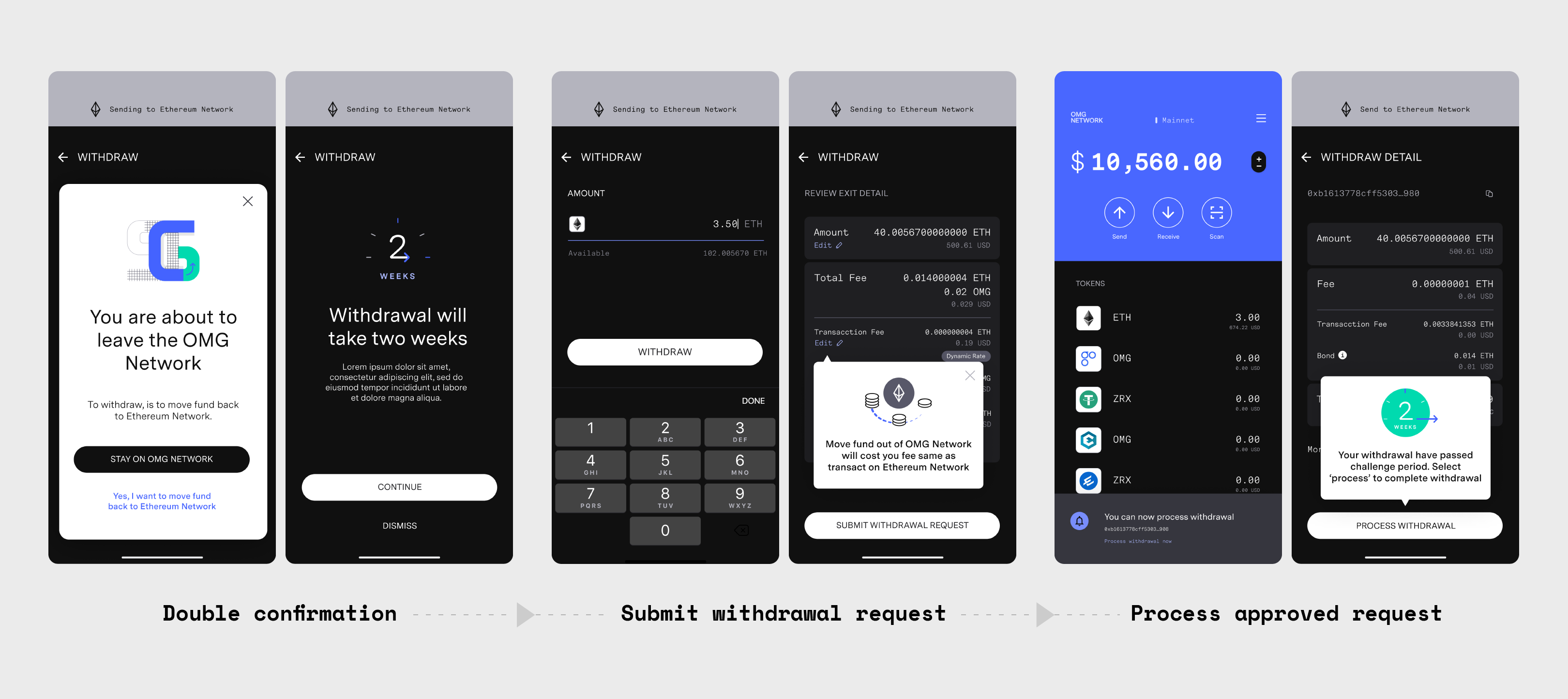
Even though the wallet set out to be a reference for builders, it was also important to leave room for creativity. The UX was built around technical conditions such as the need to pay fees and withdraw from the network.
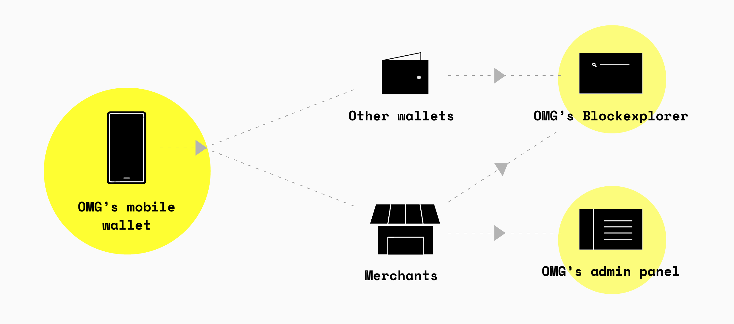
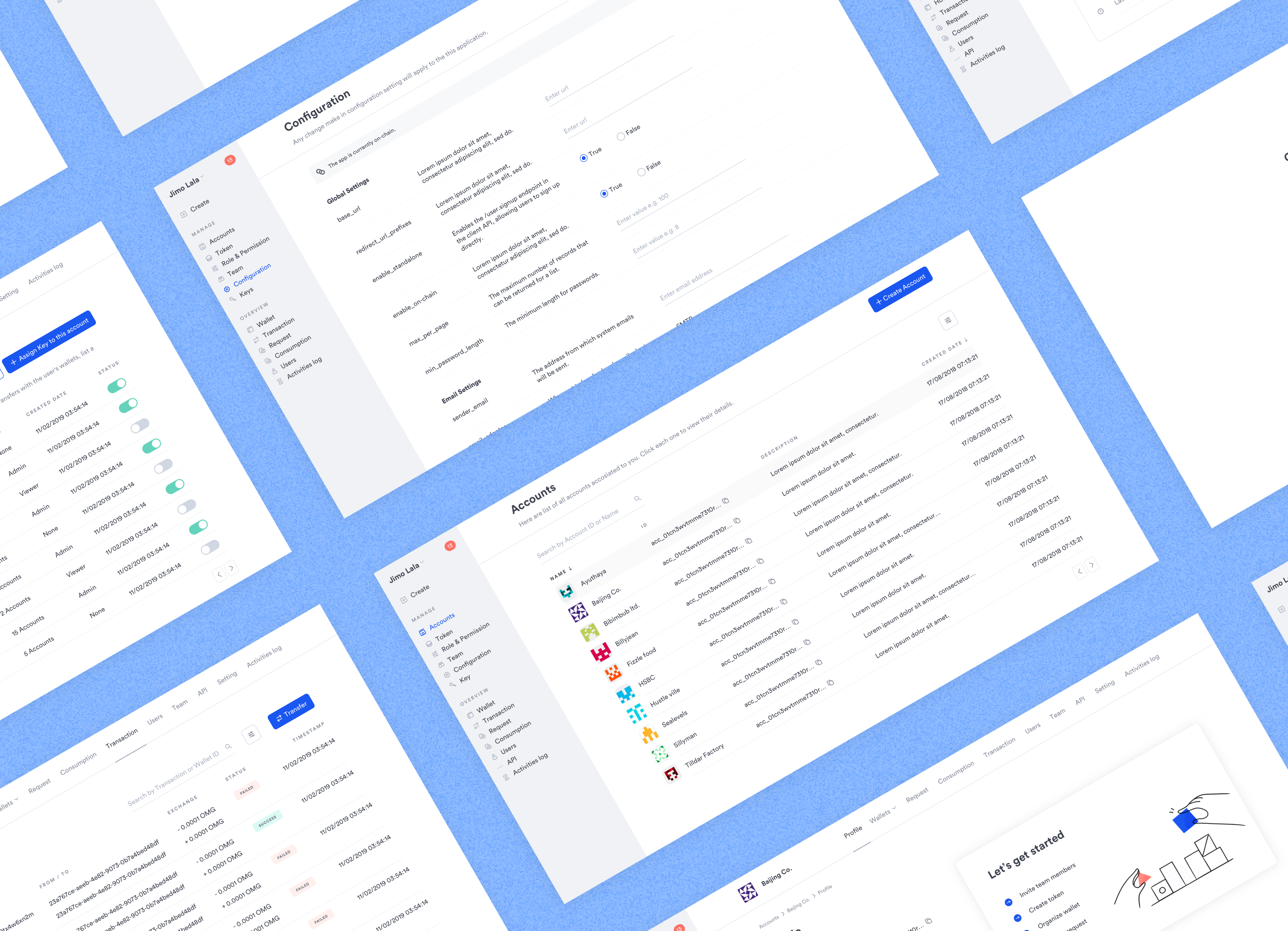
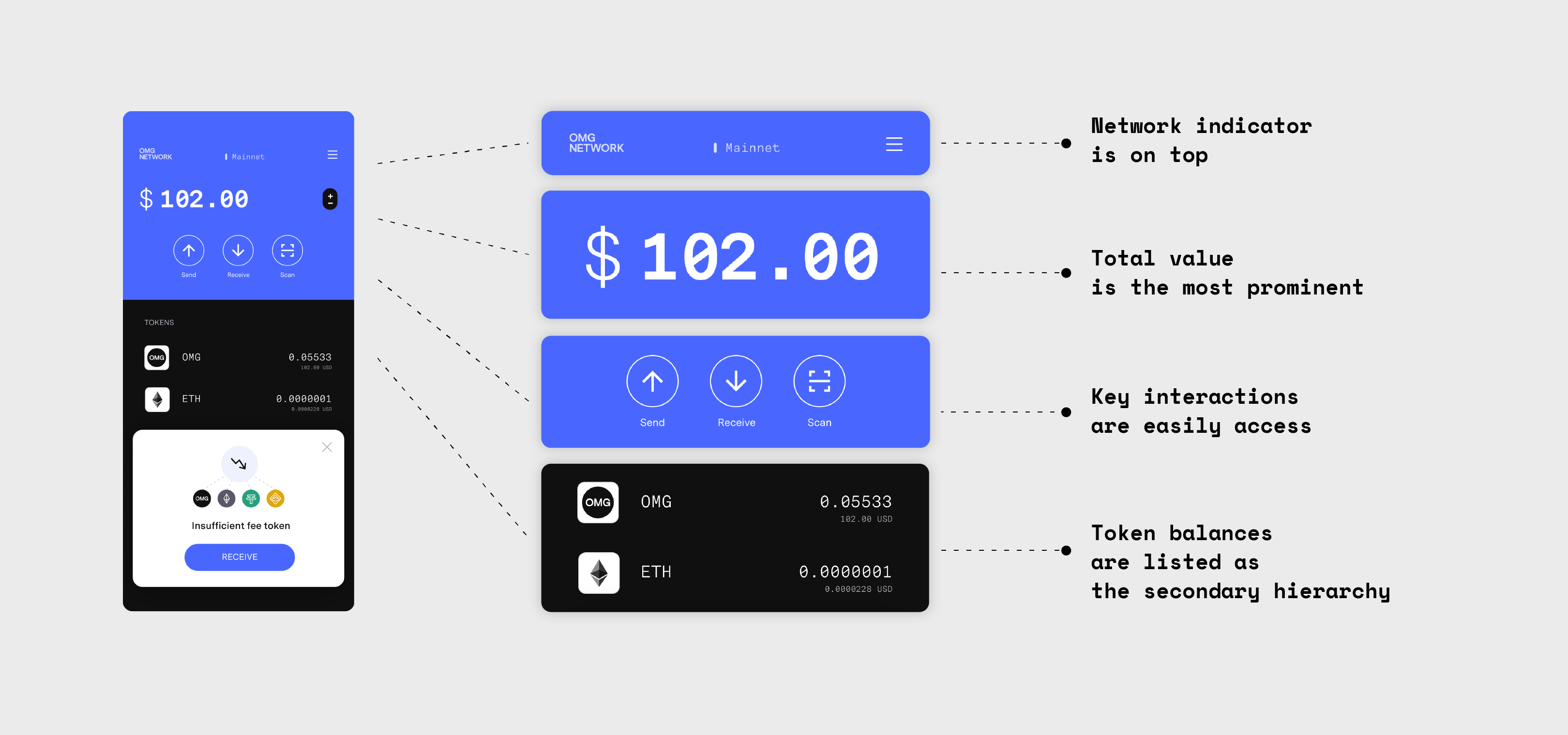
The wallet itself is designed as a modular system, open for customization allowing it to fit any use-case applicable to a wallet. Each module can be used as a base component during design. This is a very attractive feature and will be important when pitching to potential business partners. Significantly for non-crypto audiences, the wallet allows users to engage with the project without owning additional tools. Users can also compare transactions between Layer 1 and Layer 2 with ease.
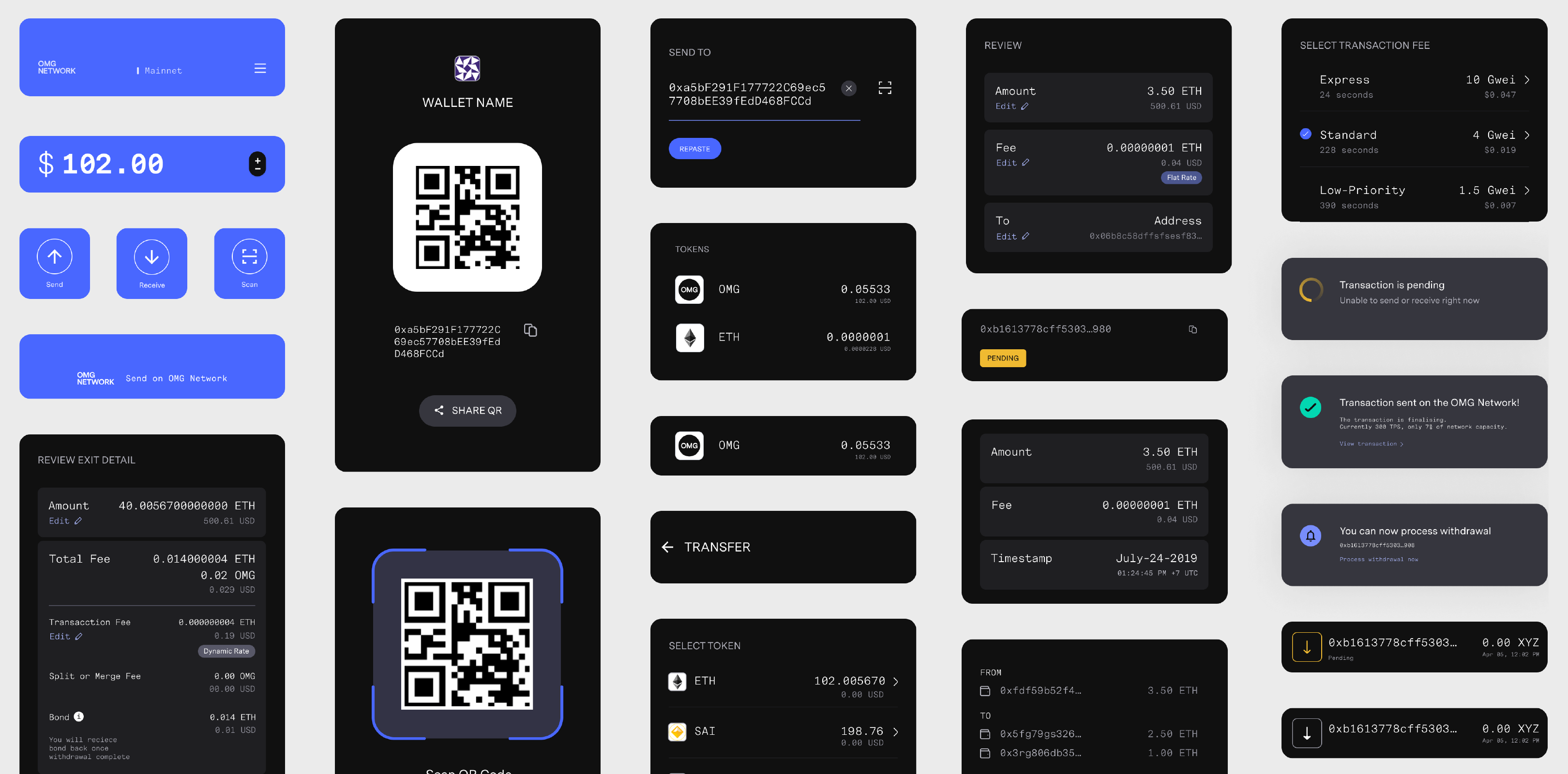
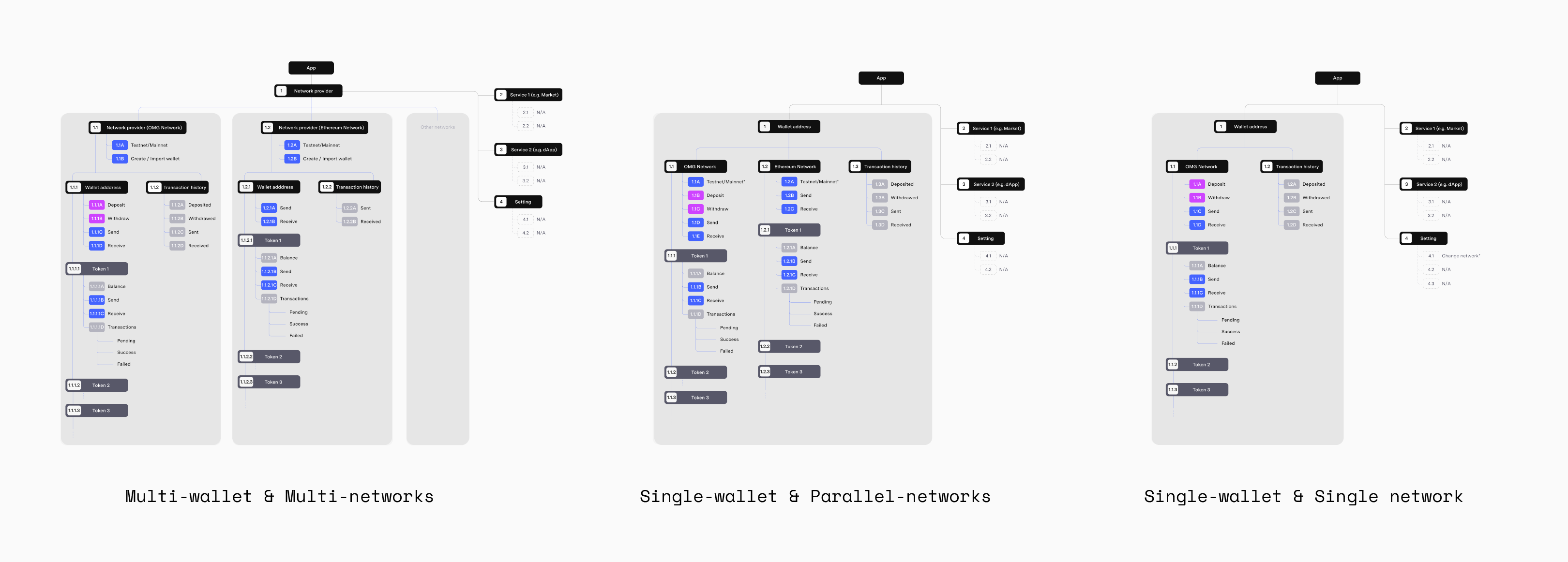
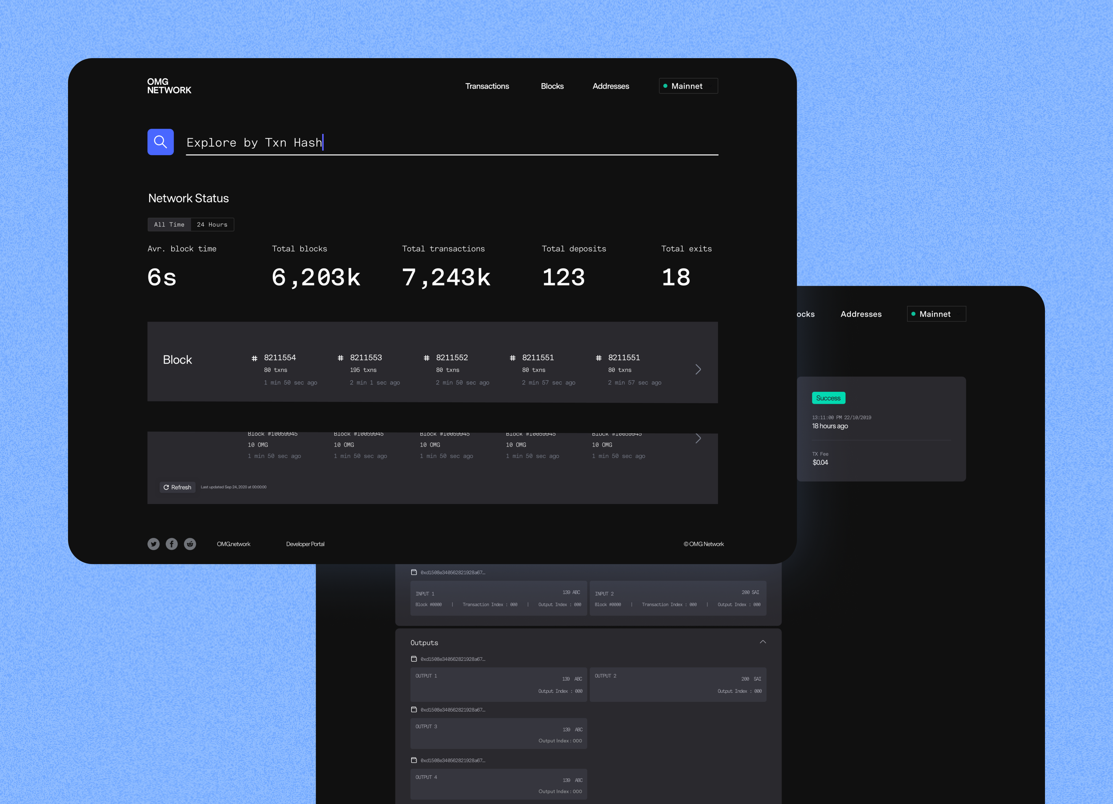
The wallet represents a key consumer touch point for the project. From a business standpoint, any transactions on the consumer's wallet will be listed on the admin panel to help businesses oversee metrics and manage token allocation. Just like on the block explorer, transactions from the blockchain are going to be listed on the wallet for anyone to track. Because of this, the wallet design needed to facilitate users to track all transaction details on the block explorer too.